
Navigation Taxonomy End-to-End UX Strategy
Stakeholder: Cross-functional collaboration with all digital enterprise health and retail teams
Project Goal: Develop a unified native application that seamlessly integrates the healthcare and retail businesses, providing users with streamlined, single-point access to all services and offerings.
Role: UX Strategist and Design Team Lead
Project: Drove forward the app’s evolution by strategically integrating healthcare services while meeting high user expectations. To achieve this, I conducted in-depth research, analyzing user feedback and app analytics, collaborating closely with research partners and executive leadership, and gathering critical data from MLPs, OKRs, and the current sitemap.
Using these insights, I created an enhanced sitemap and taxonomy that skillfully incorporates healthcare services while prioritizing the retail presence. Following this, I led a roadshow with my team, collecting targeted feedback across business units to better understand their unique needs. This informed a more detailed sitemap, outlining necessary access points for a better user experience.
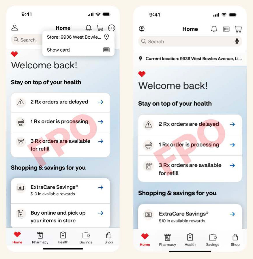
The results of this integration are visible today with the reimagined tabs taxonomy, which has collectively driven a 24% increase in user engagement and a 16% increase in interactions. This achievement underscores my commitment to scalable, user-centric innovation that advances business goals.
Challenges & Solutions: There were two major challenges that were faced during this project.
1. The absence of a predefined sitemap presented a significant challenge in building a new, cohesive taxonomy from the ground up. Without a foundation to work from, I had to create a structure that balanced both healthcare integration and our retail priorities, ensuring a seamless user experience.
2. Aligning executive product and design leadership was an ongoing challenge as shifting priorities required continuous adjustments. Navigating these changes demanded adaptability and strategic influence to maintain alignment and momentum across the project’s evolving focus.
Progressive Release Plan
Through cross-team collaboration, this progressive release plan allowed sufficient time for designing and developing screens for the new tabs, ensuring a well-structured implementation.

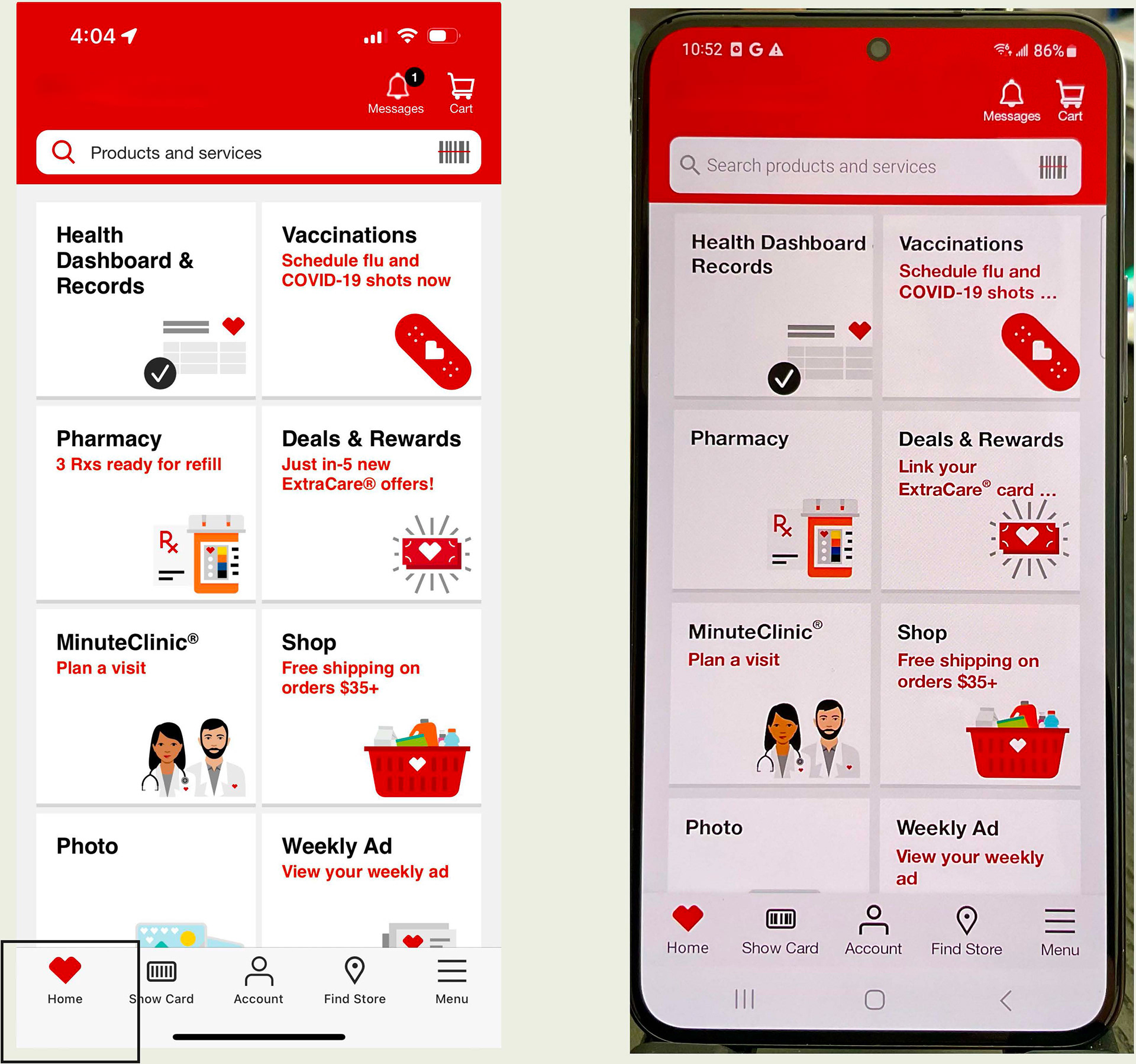
App Navigation
The new taxonomy (right image tab bar) unifies multiple lines of business within a single app, creating a seamless and intuitive user experience. By providing a centralized access point for everything from shopping to health services, this strategic initiative not only enhances user convenience but also drives alignment with key business objectives, ensuring a cohesive and high-impact digital experience.
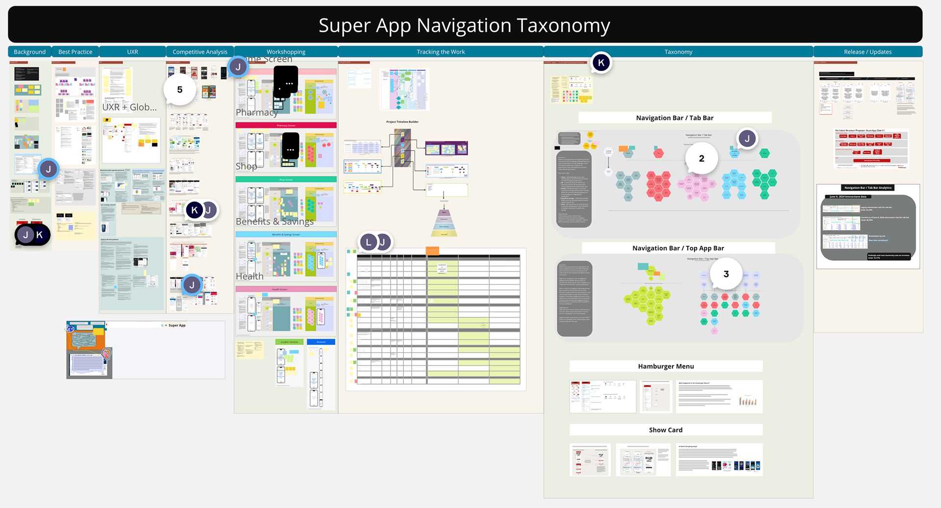
UX Strategy Wall
A UX wall streamlined the strategic planning process for the taxonomy, enabling a clear and efficient introduction of new tabs for users to the various teams involved. This proactive approach fostered strong cross-disciplinary collaboration, driving alignment and accelerating execution for a seamless user experience.
_________________________________________________________________________________________
PropSwap Mobile App End-to-End UX Experience
Stakeholder: PropSwap, the first and only secondary sports betting marketplace in the U.S.
Project Goal: Design and develop a seamless mobile app experience that complements PropSwap’s existing website, providing users with instant access to their accounts and an intuitive platform for buying and selling sports bets on the go.
Role: As the lead UX/UI designer, I owned and executed the end-to-end design process. My responsibilities included:
• Designing the end-to-end user experience (UX) and user interface (UI)
• Creating and managing the app’s component library
• Conducting user testing and leveraging feedback to align the app with business objectives
• Collaborating with stakeholders to ensure a strategic and user-centric approach
Project Overview: To enhance user engagement and accessibility, PropSwap needed a mobile app that provided the same robust functionalities as its website while optimizing the experience for mobile users. I led the initiative by:
• UX Strategy & Design – Conducted research and competitor analysis to inform wireframes and prototypes that streamlined the user journey.
• UI Design – Created a clean, intuitive interface that balanced aesthetics with usability, ensuring consistency across the app and website.
• Component Library Creation & Management – Established a scalable design system that enabled efficient development and future enhancements.
• User Testing & Iteration – Ran usability tests to validate design decisions, gathering feedback to refine the experience and better align with user needs and business objectives.
• Stakeholder Collaboration – Worked closely with product managers, developers, and executives to ensure design decisions met both user expectations and business goals.
Challenges & Solutions:
1. Ensuring seamless user adoption – Conducted usability testing to identify and address friction points, resulting in an intuitive onboarding process.
2. Balancing business goals with user needs – Used data-driven insights to create a user-friendly experience without compromising revenue-generating features.
3. Maintaining design consistency – Developed a robust component library to streamline UI updates and maintain uniformity across platforms.
4. Optimizing performance for mobile users – Simplified navigation and interactions for a smooth, responsive experience on various devices.
The successful launch of the PropSwap app provided users with a frictionless and efficient way to manage their accounts, significantly enhancing engagement and transaction volume. This project established PropSwap as a leader in secondary sports betting by delivering an innovative, user-focused mobile experience.
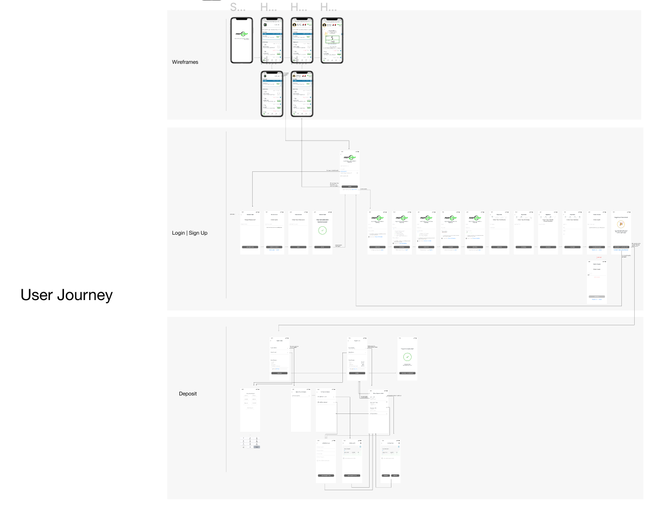
User Flows
Given the complex user flows required to build the app, this is a concise example of the user journey mapping incorporated into the handoff. This strategic approach ensured clarity, efficiency, and seamless implementation, empowering the development team to execute a user-centric experience effectively.
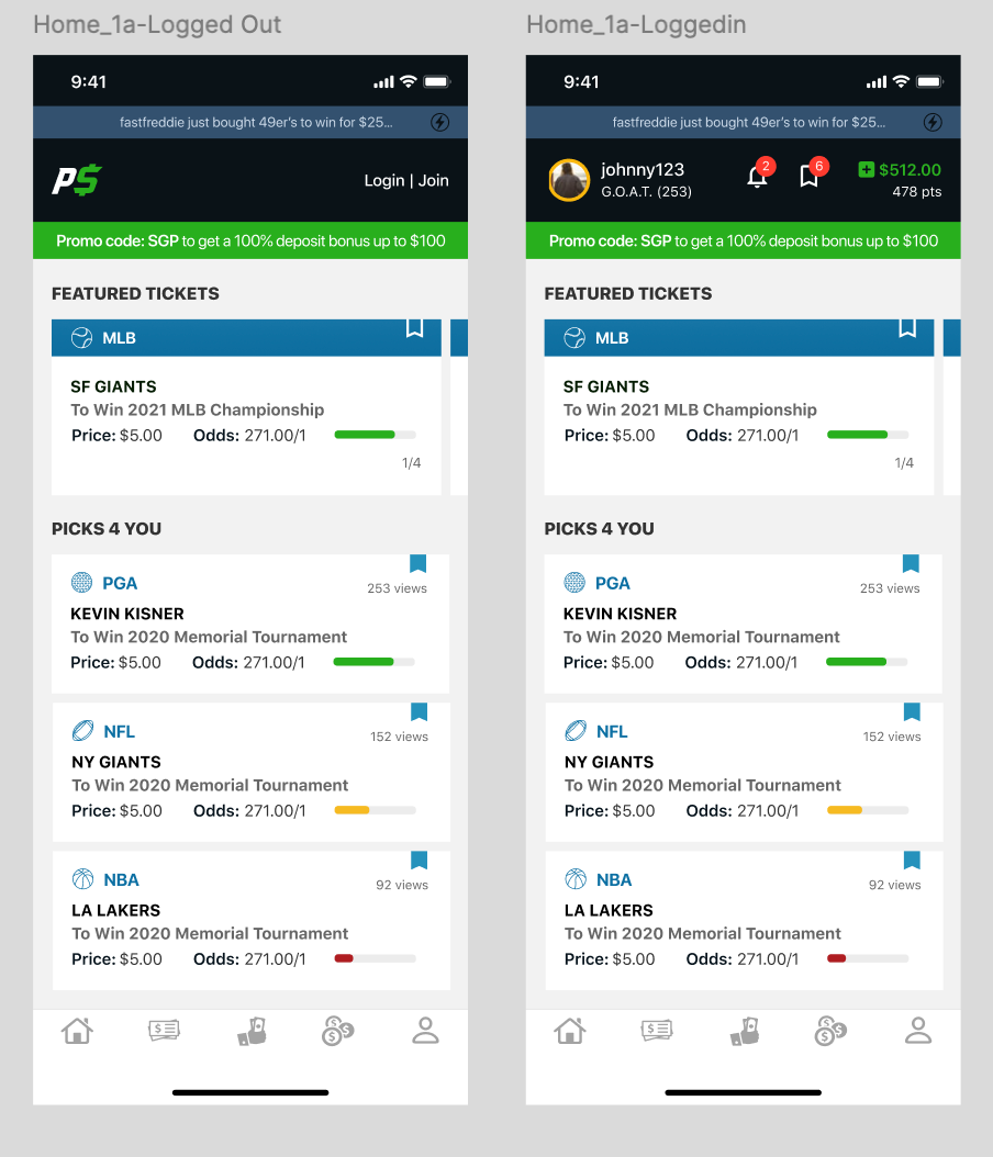
Mid-fi Designs
These screens showcase part of the design journey from a logged-out state to a fully authenticated user experience. A key aspect of the project scope was gamifying the experience by rewarding users with points upon login. To ensure this was done responsibly, a time-based restriction was strategically implemented per account, ensuring an engaging yet balanced user interaction.

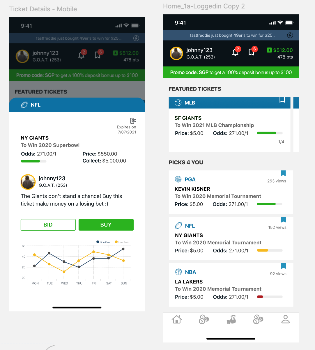
Final Designs
Collaborating with stakeholders the final delivered designs were crafted with a user-first approach. For non-logged-in users, I designed a lightweight experience that offers a glimpse into the app’s core functionality, allowing them to engage without full access. Once logged in, users unlock the complete experience—not only browsing available sports bets but also accessing in-depth stats presented in the sheets. In the prop swap experience, I structured all components within a scalable design system, ensuring seamless future iterations and global updates.
_________________________________________________________________________________________
Herbalife UX/UI Design
Stakeholder: Herbalife is a nutrition and weight management company that sells its products through independent distributors.
Project Goal: Create a mobile friendly web application that would allow for their independent distributors to keep track of sales, downline and business activities.
Role: UX and UI Design
•Wireframes
•Flows
•Layout
•Prototyping
•Deliverables
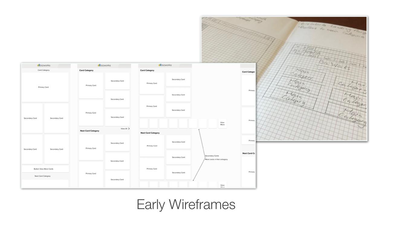
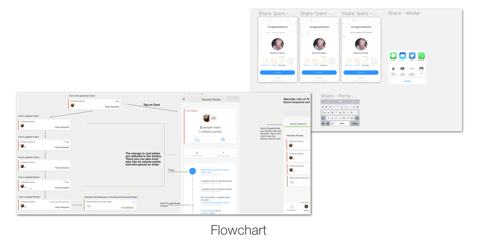
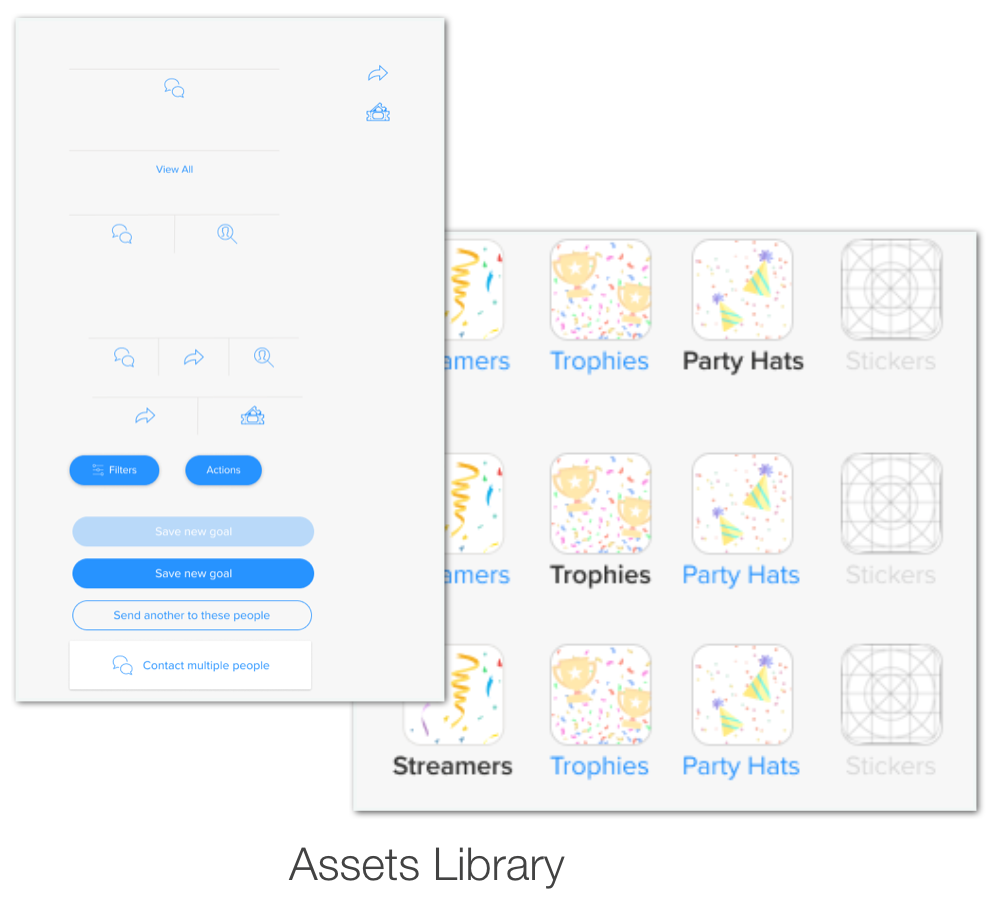
Project: I came in at the middle of this project so it was my responsibility to learn fast. I was tasked with creating the wireframes for the desktop site which was quickly scrapped as the stakeholder decided on a mobile site. Switching gears I was tasked with creating cards to hold various content. As the project evolved I took over creating the UX and UI for the Congratulations page.
For the UI Design part of this project I followed the style guides and kept in mind simplicity as well as ease of use. Knowing that less is more when it came to this project it was a goal of mine to not clutter the designs. They needed to feel inviting yet each component needed to be functional.
Taking the lead on the final UX part of the project it was my responsibility to make sure that all necessary components were created and in the component library. As the lead prototyper the goal was to create a native app experience that behaved as the end user would expect. It was important for the user experience to be interactive, engaging and fun.
Challenges & Solutions: There were two major challenges that were faced during this project.
1. The stakeholder found it challenging to visualize low fidelity wireframes. This was overcome by creating high fidelity wireframes while implementing UI Design.
2. Project direction changed from creating a mobile and desktop site to a native app. Being able to quickly switch gears allowed for the change in direction with minimal design interruption.
Below are screenshots of some UX/UI design screens I was responsible for.

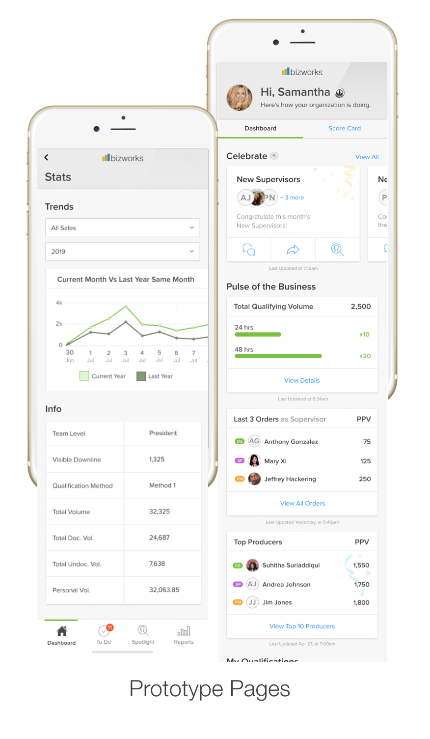
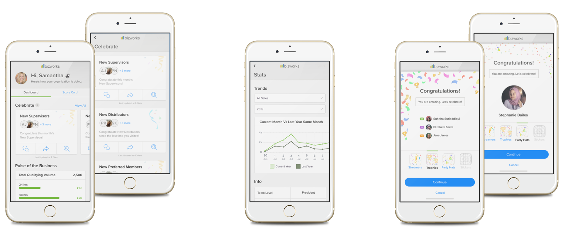
Final Visual Design
_________________________________________________________________________________________
ScifCom
Stakeholder: ScifCom is a data security company that prides itself on the latest encriptive technology.
Project Goal: Create a website that is clean, easy to navigate and lets its end user feel secure.
Role: UI Design
•Iconography
•Page design
Project: I was asked to come up with two different options for icon design that the end user would see when performing certain functions. The other part was to design the blog page using the wireframe as my guide. The rest of the project was handled by the design team assigned to it as I was heavily involved with a different project.
To create custom icons I conducted research to see what kinds of data and security icons already existed. After a few sketches I decided on the two variations to present to the design team.
For the webpage background I researched different blog pages for inspiration. While doing that I got a text message and viola! The chat bubble background came to life.
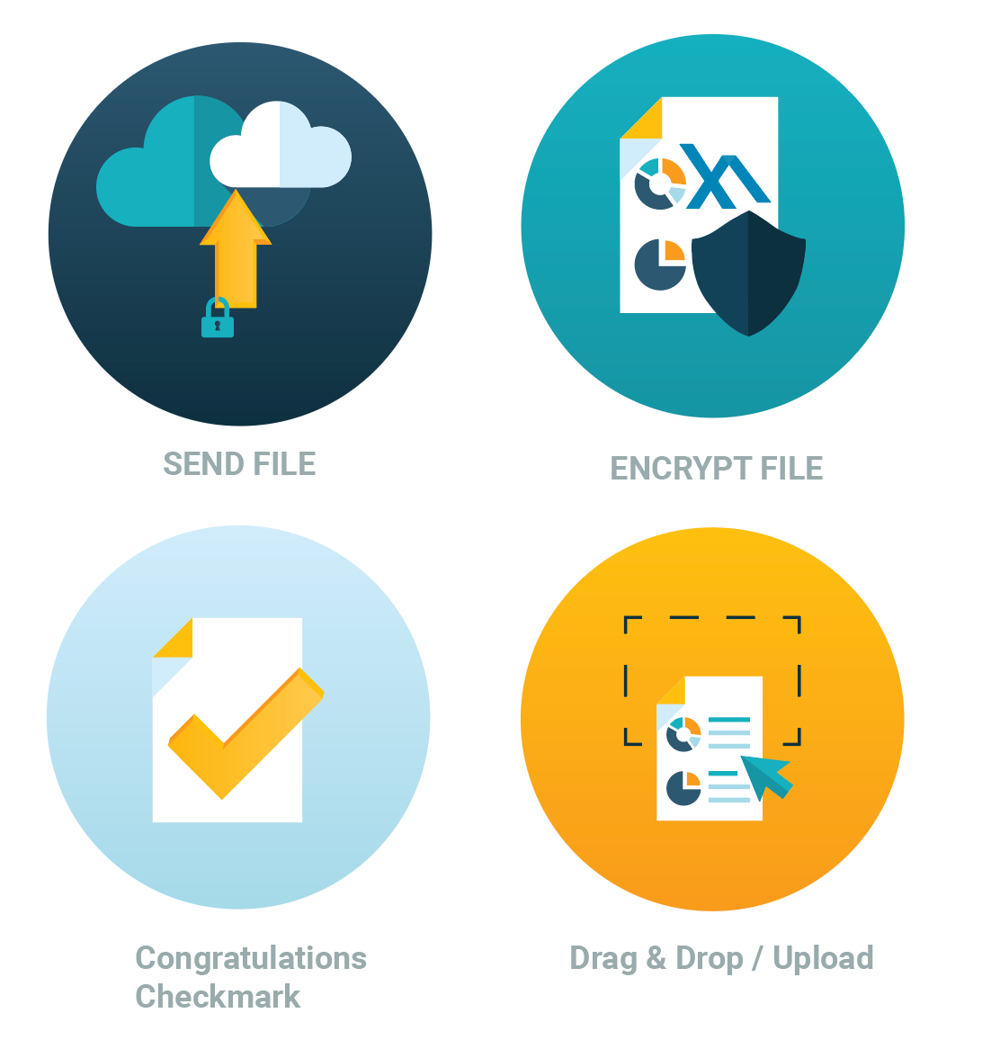
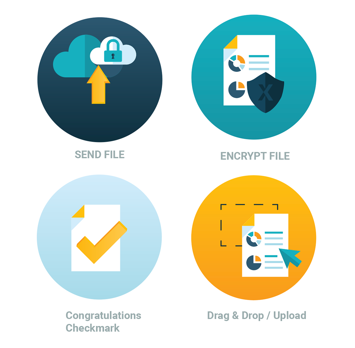
Iconography
Taking icons and turning them into something new can be a fun challenge. Here are two slightly different variations of the same icons.
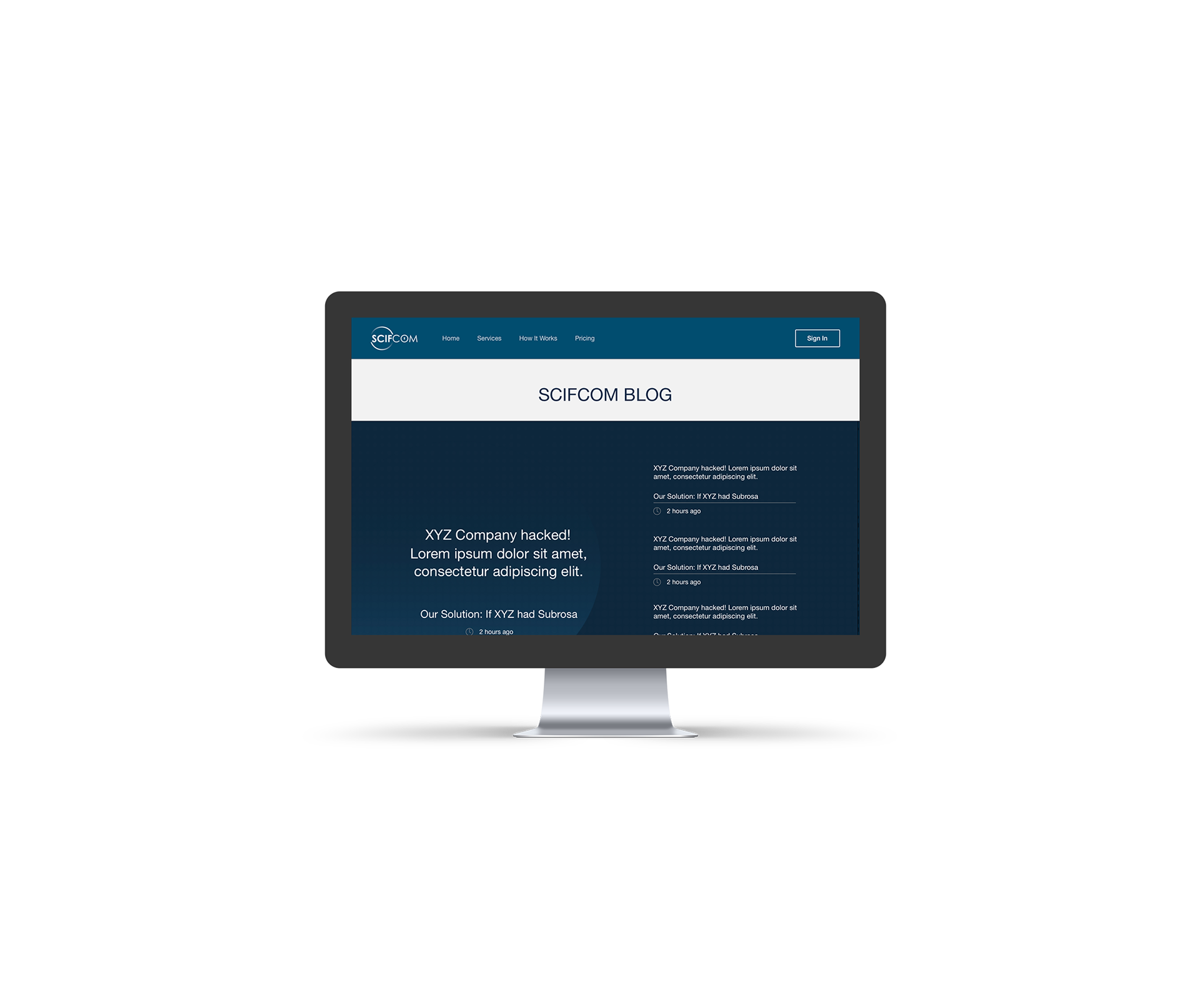
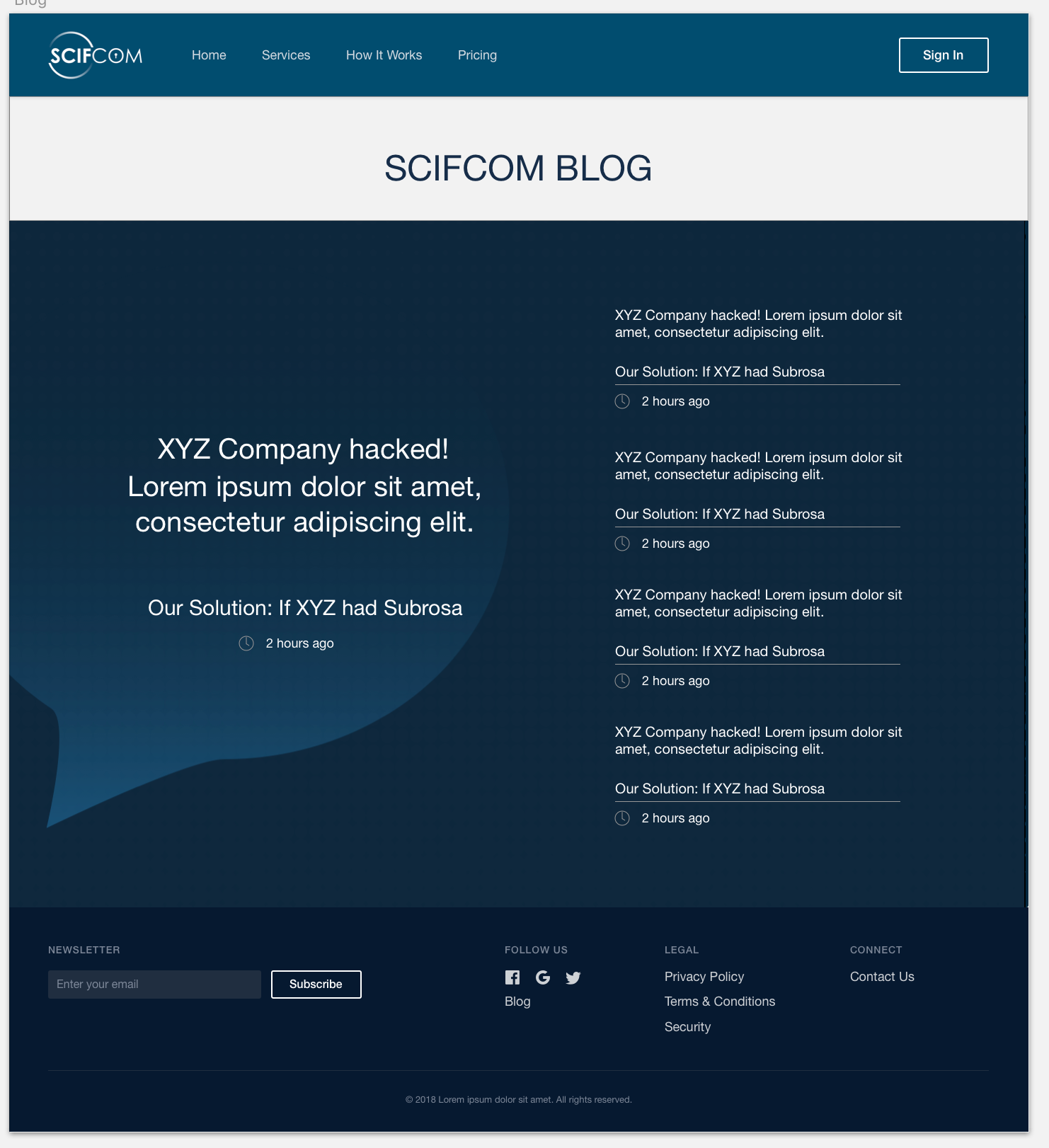
Webpage Background
Creating hierarchy in this page was the main goal. Bringing attention to the main article while still having teasers and links to the other content. Keeping in mind the excitement we get from seeing the chat bubble was the inspiration for this background design.
_________________________________________________________________________________________
Find My Stuff
Click the link to explore the Interactive Prototype
Stakeholder: Find My Stuff is a fictitious company that uses GPS to assist in finding misplaced or lost items.
Project Goal: Create a native app to assist end users in tracking where to locate their misplaced or lost items. The app needs to be semi-customizable to where the user may enter their items in a list for them to track.
Role: UX Designer
• User Journey
• Wireframes
• Prototype
• Deliverables
Project: Tasked with creating a native app using UXD and HCD I asked myself the following questions:
• What would be most useful?
• What will help make people's lives easier?
• How would the end user interact with the app?
Thinking about how common it is for people to misplace their car keys, eyeglasses, smartphone as well as other things I decided to create an app that would assist people in finding their stuff. Doing extensive research to see what was available on the market I found that tracking your belongings was not as easy as it could be. The thought behind Find My Stuff is that it would use a disposable sticker that would contain a microchip. Each sticker would have a unique tracking number that coincides with the barcode printed on each sticker.
Challenges & Solution: Creating a native app that does not yet exist meant that there were no real standards to follow. At the same time it also allowed for full creative freedom.
After doing extensive research to see what is currently available on the market, trackers and apps, the app page wireframes were born. From there a working prototype was created and changes were made to give the end user the experience of Finding My Stuff.
Below are the deliverables: documentation standards, user journey, template, annotations and wireframes.
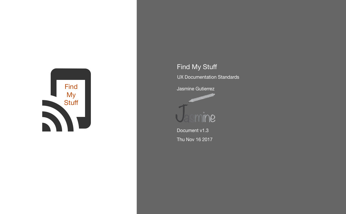
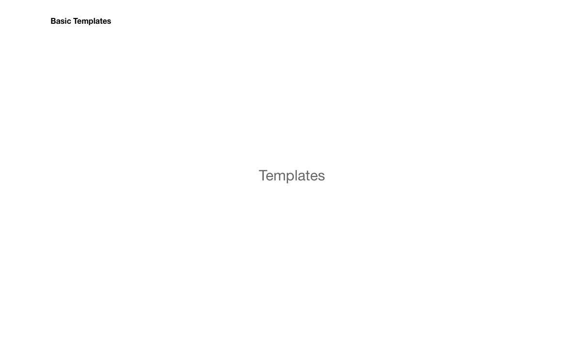
Cover page for deliverables. I like to have a simple and clean cover page free of unnecessary distractions.

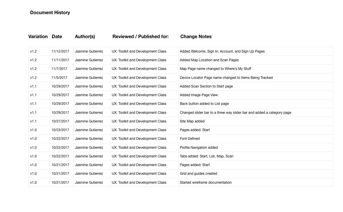
Document History:
*Major changes during the design process
*Helps to see the development of the design process

The site map shows the user journey starting from the welcome screen to the tracking screen.
Template Shows:
*Dimension guide
*Placement
An iPhone 8 was used to model the standards.

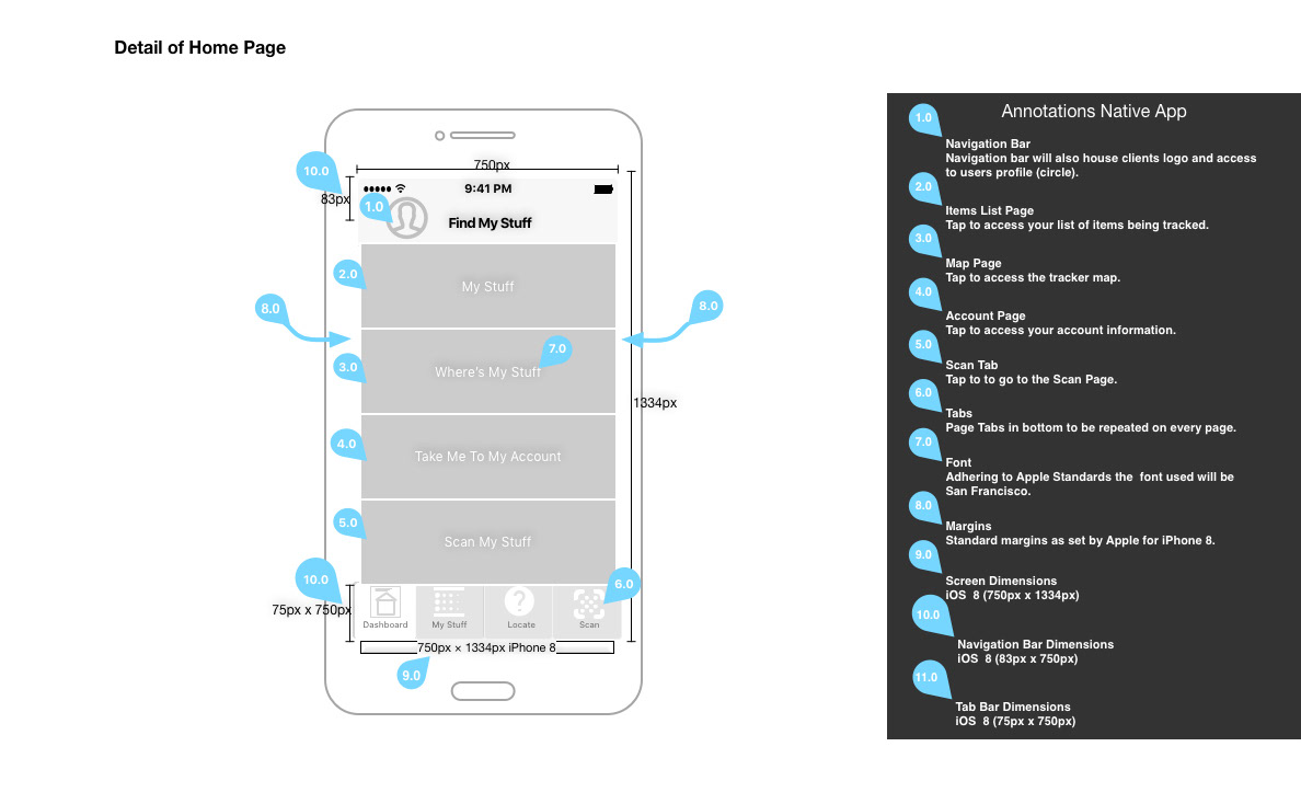
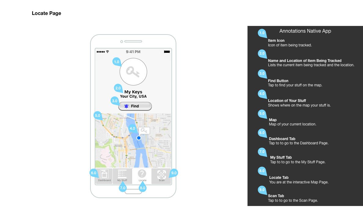
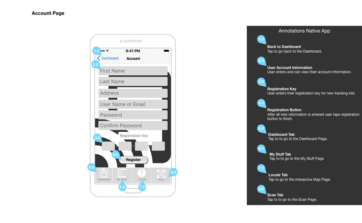
Annotations:
*Assist the developer with understanding what they are looking at
*Lets them know what areas are repeatable
*Tells the behavior and functionality of each component
It's important to have clear and concise annotations.
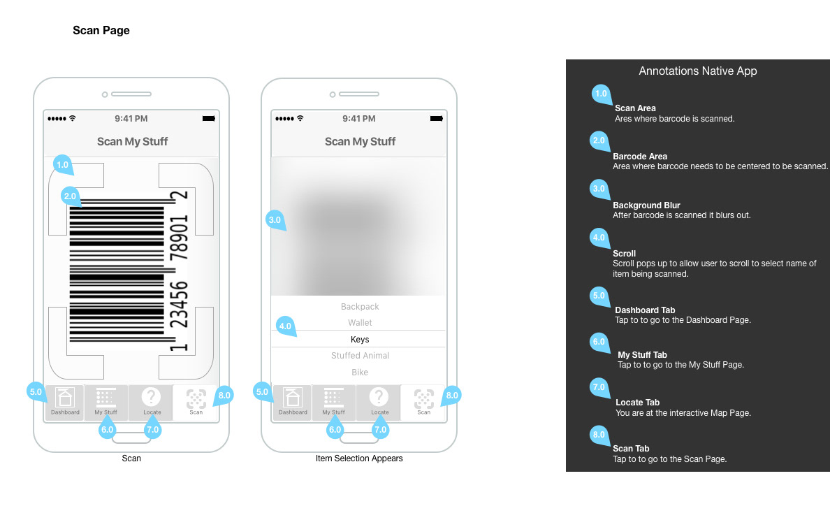
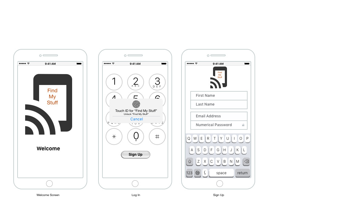
Wireframes show a clear view of the user experience
