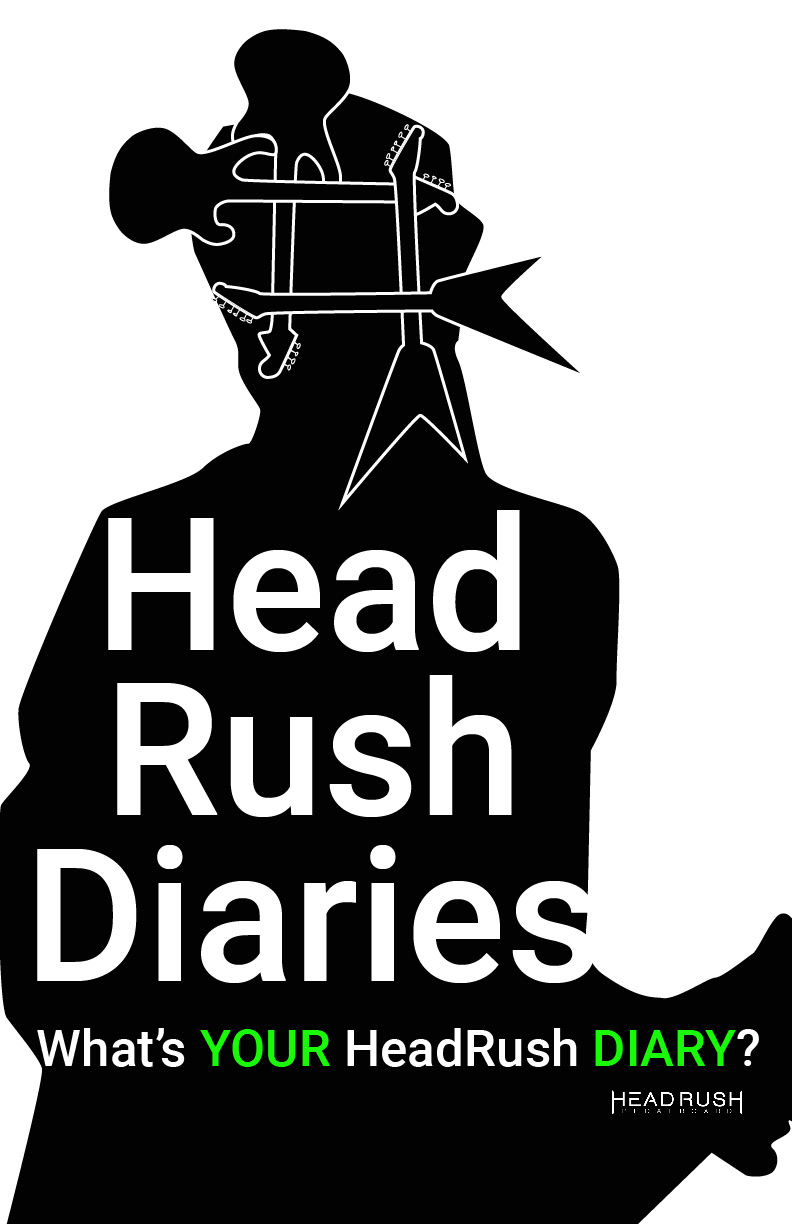
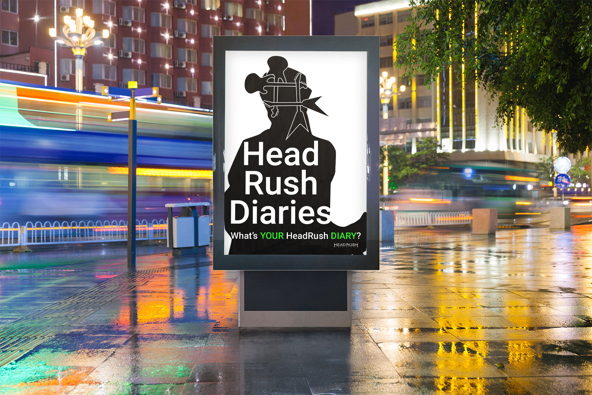
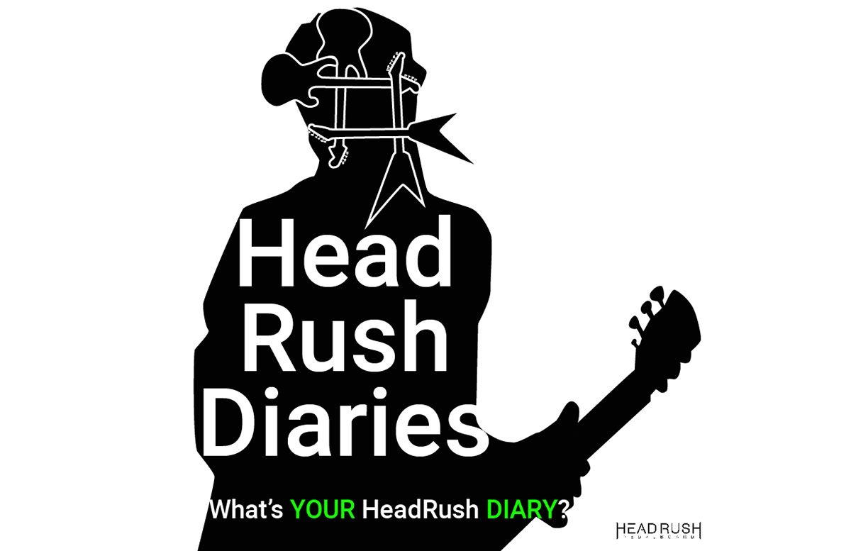
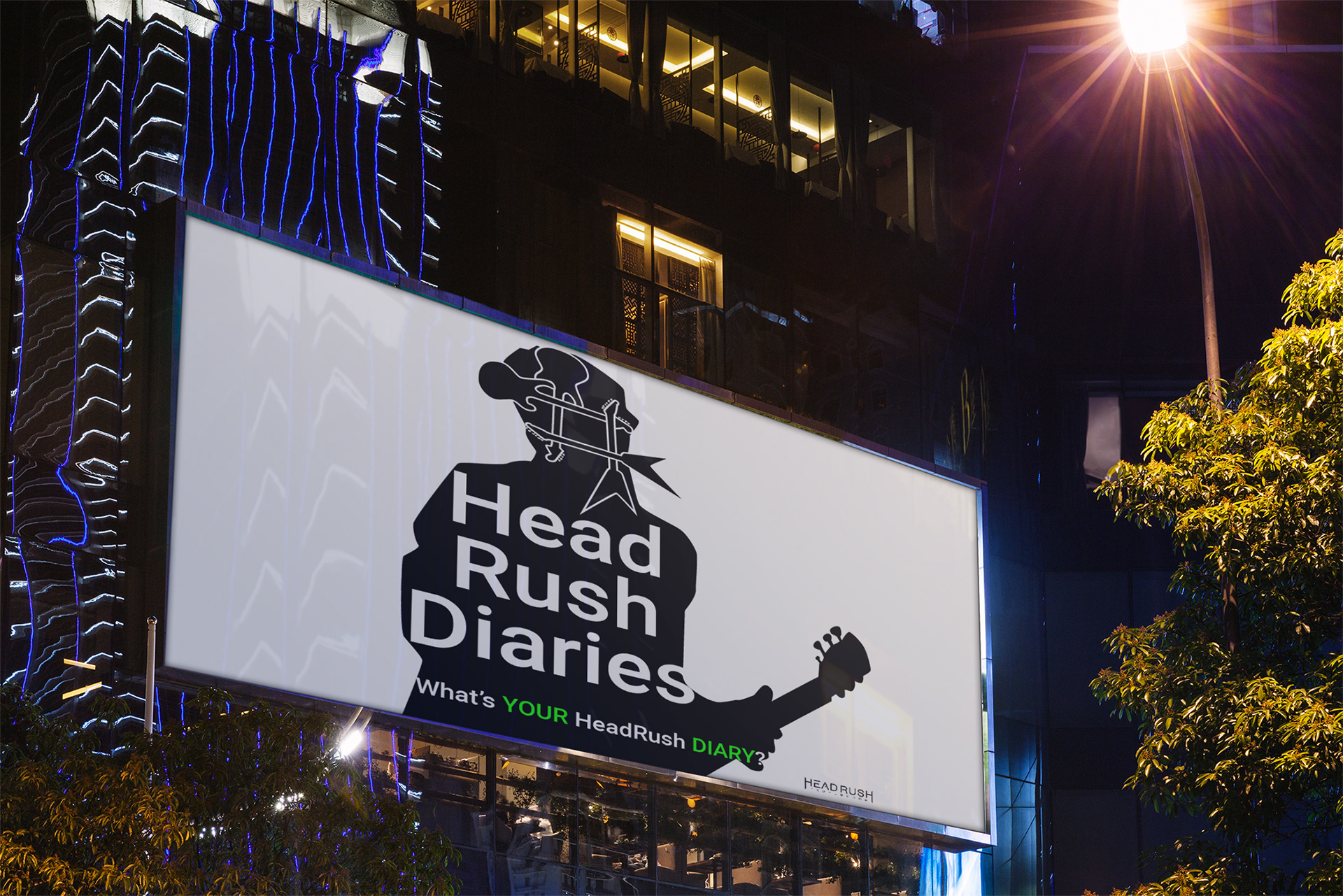
As designers we need to think about how a design is going to be used. How does it move with the different layouts? With this one the main design needed to fit on a billboard but also be movable to fit in other formats. To create hierarchy a bright green, which matches the green on the peddle board, was used for the key words. The wordage and graphic needed to be simple so the audience could see it while on the highway. It’s also easier to reposition a simple layout. Using a play on the words “head rush” the hashtag was purposefully placed over the head of the musician.
_________________________________________________________________________________________
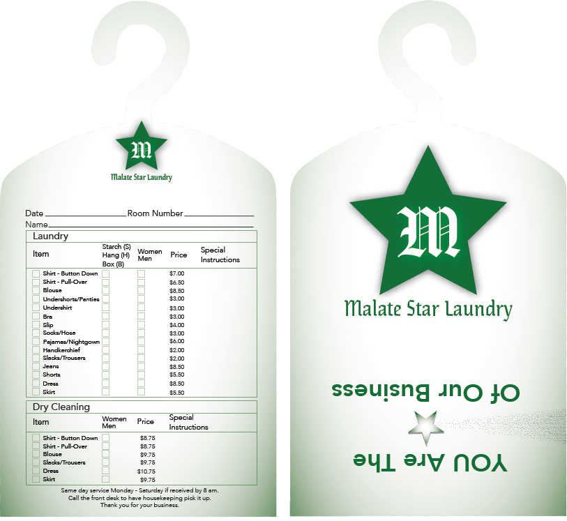
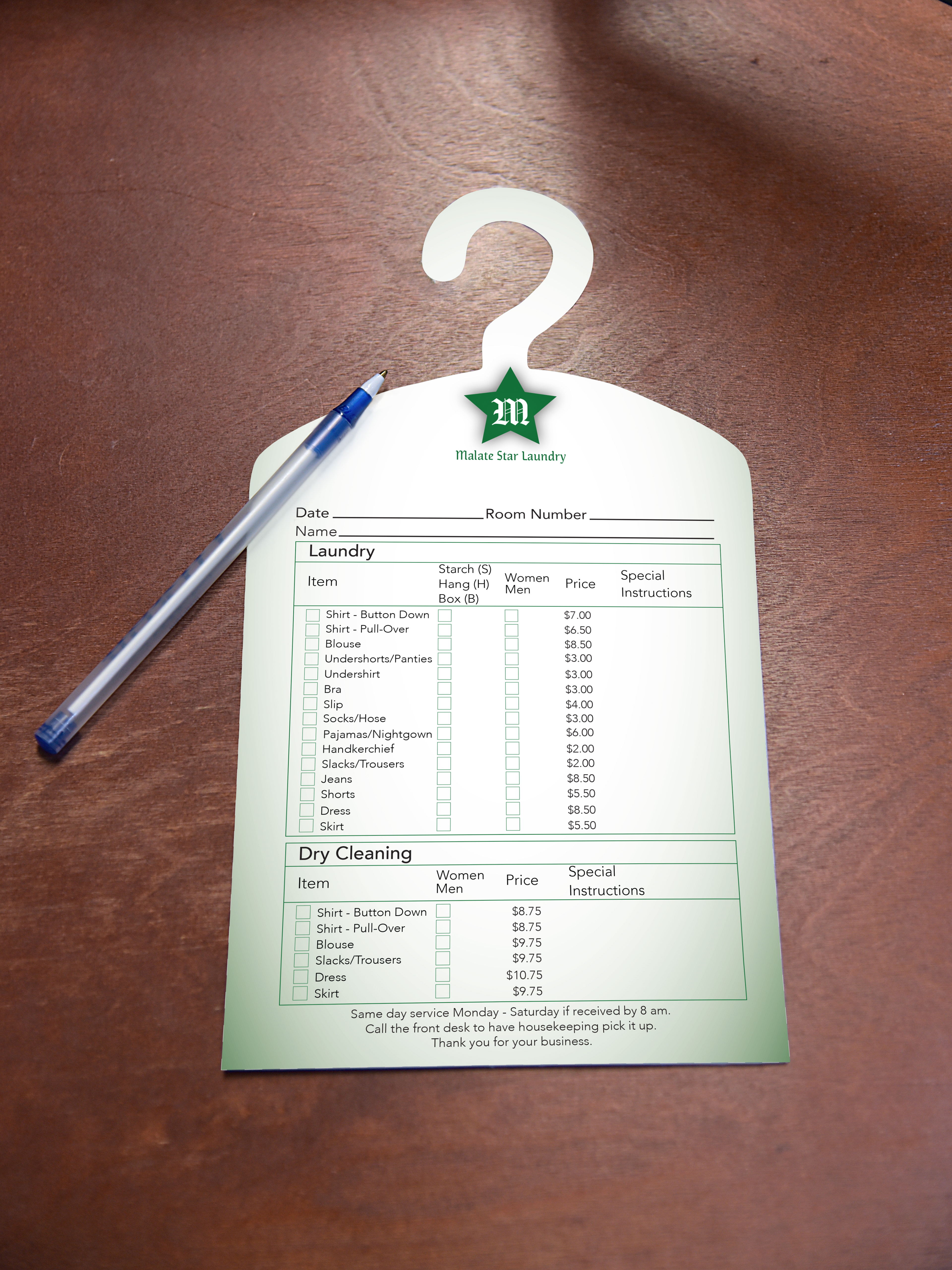
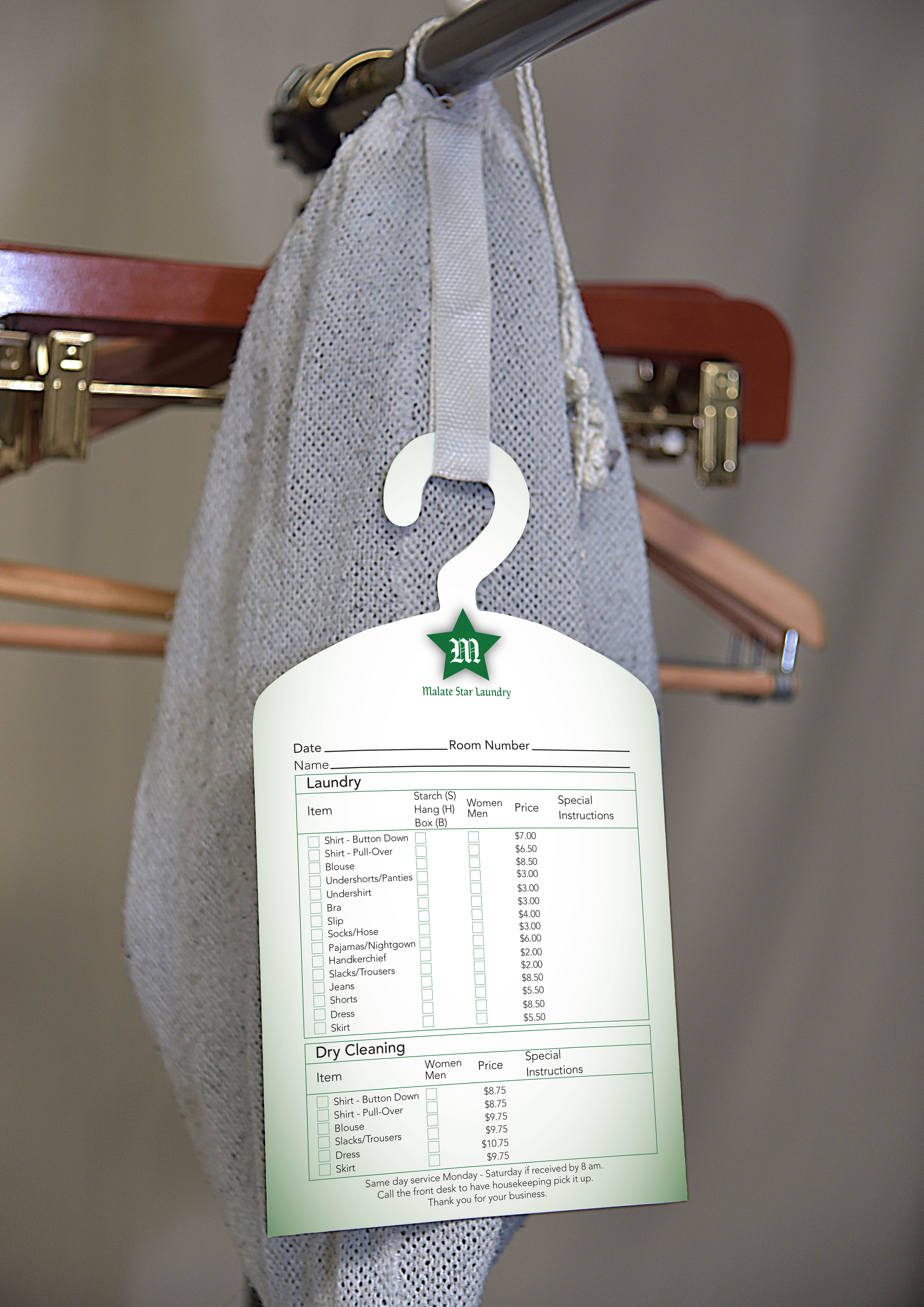
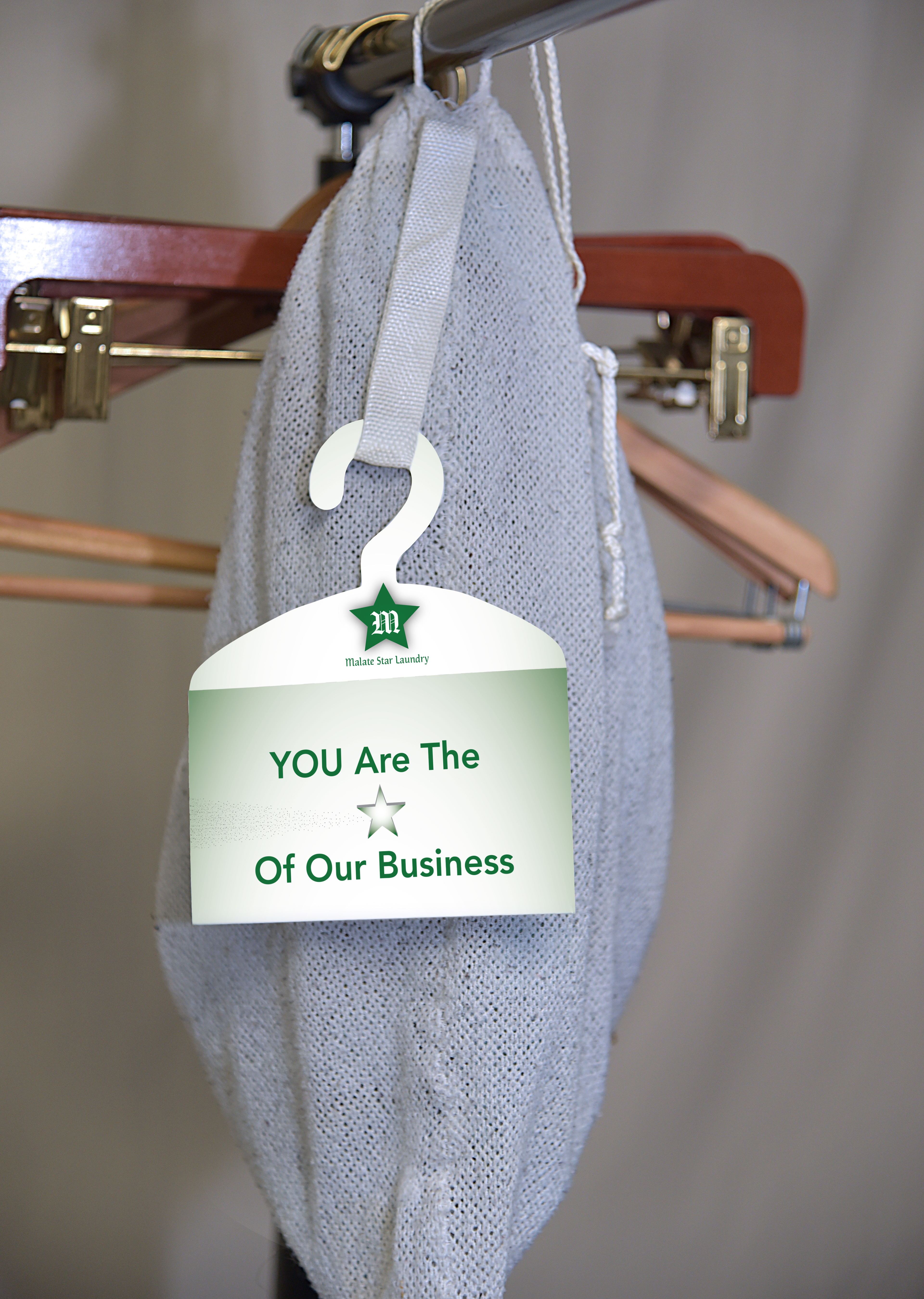
This laundry brochure was a fun one to design. Hotel laundry brochures usually are boring and get tossed aside. This one will capture your eye and hopefully put a smile on your face. The inspiration behind it was a hanging clothes bag.


_________________________________________________________________________________________
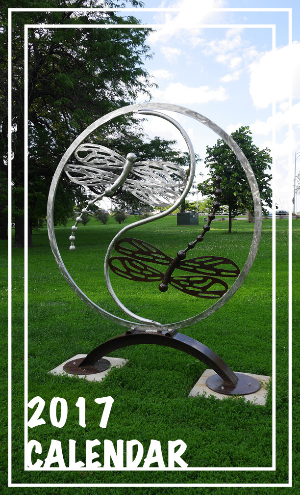
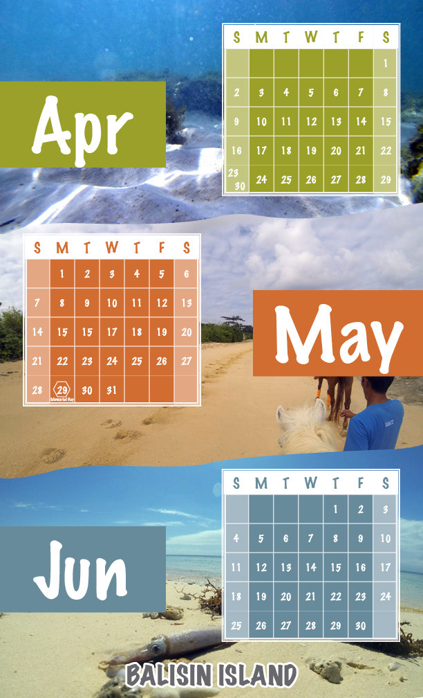
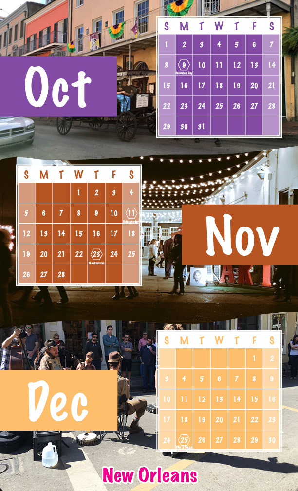
Sometimes being cooped up in a office or room can be a bit daunting. This calendar will transport you to a different place each month where you can take a mental vacation.


_________________________________________________________________________________________
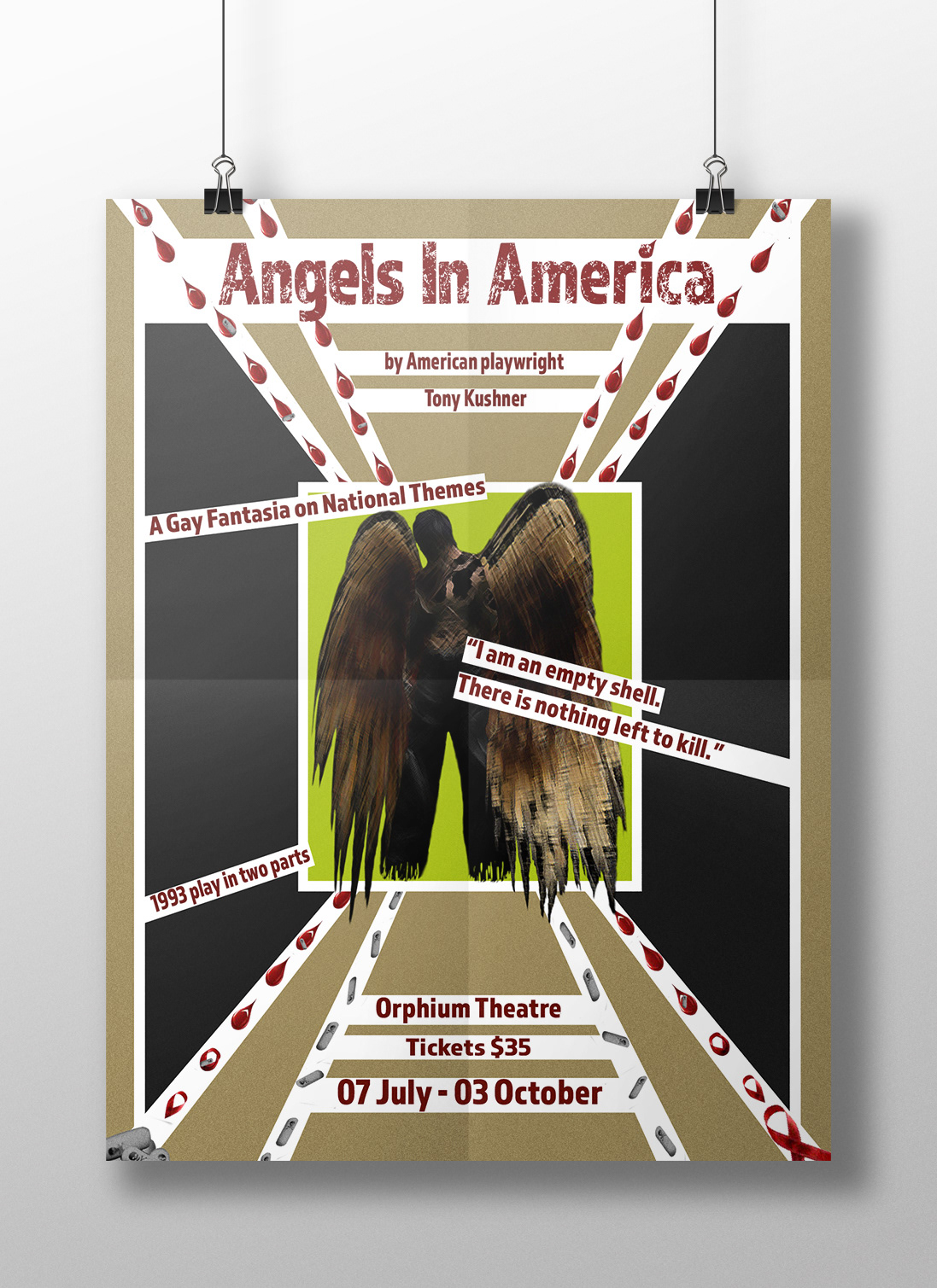
Poster designed using one of my favorite styles, Russian Constructivism.

_________________________________________________________________________________________
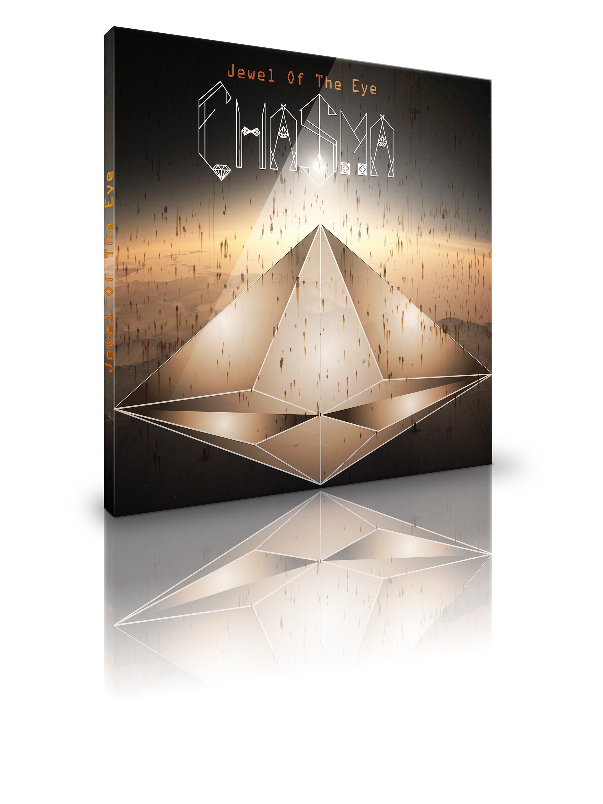
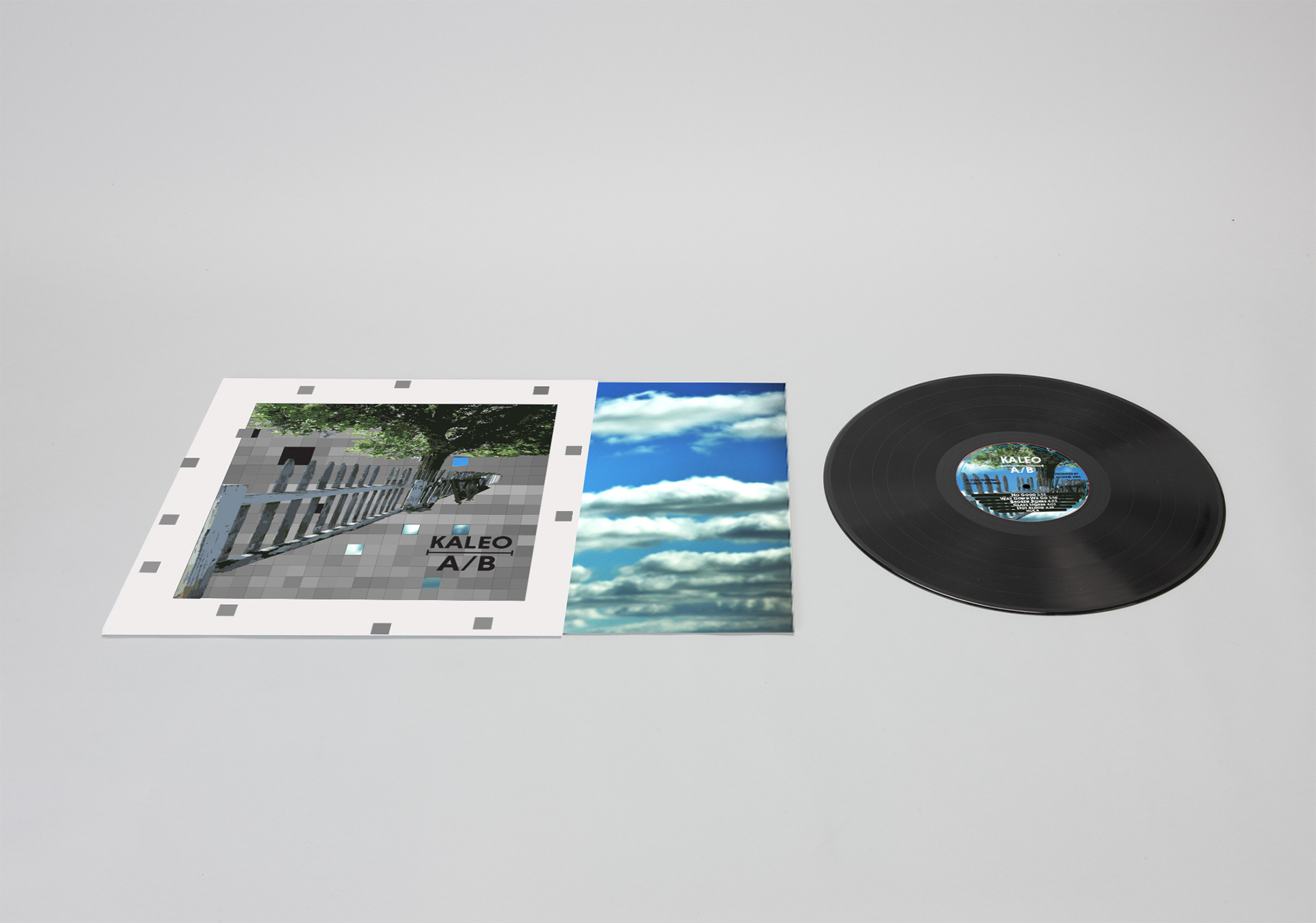
Having a love for design and photography I was able to utilize both my skills in creating these original CD and LP designs.

_________________________________________________________________________________________
Savor your journey through the world, that statement has lead me here, to being a designer. This book was created fully in Indesign. Yes, the illustrations were also created in Indesign. It is my wish that you enjoy your reading as this takes you through my journey of the creative world.